
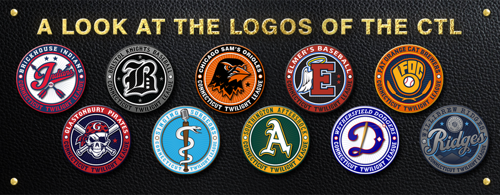
2019 Team Badge Power Rankings
By Brian Murray
The Connecticut Twilight League is a powerhouse of unique and impactful team badges. From the Glastonbury Pirate staring down the opposing team or Barile Realty Indians’ timeless varsity script with crossed arrows, each team badge (logo) attempts to set the tone and expectation for the team it represents. Which logos hit it out of the park and which ones need to hit the batting cages for a little more work? Here are the 2019 Team Badge Power Rankings.
10) The Singing Surgeons.
![]()
Colors: Light Blue and White
Logo: A baseball bat replaces the traditional rod in the “Rod of Asclepius” (that’s right wikipedia was used) with a classic microphone on top create a fitting visual to pair with the team’s name.
Opinion: With possibly one of the most unique team names you could find, they matched the name with an equally unique logo. Unfortunately, grouping their logo and colors onto their patch, forces other teams to squint to make understand what they’re looking at. If the snake gets a little more attitude, and the color contrasting is tweaked, the Surgeons would have a chance to jump from the bottom to the top.
9) Wethersfield Dodgers
![]()
Colors: Royal Blue, White, Red Accents
Logo: A cursive D, with a baseball flying off a bat, and a diamond ingrained in the D itself.
Opinion: The Dodgers created a classic feeling logo with their classic name, the historic color scheme and light-blue pinstripes in the background are a beautiful homage to traditional baseball logos. On the other hand, the logo matches a 3D bat with a 2D graphic leaving the logo feeling slightly disjointed, and at a quick glance the ball coming off the bat could be missed.
8) Southington Aftershock
![]()
Colors: Hunter Green and Gold
Logo: A gothic A morphing into a lightening bolt / crack on the right bottom outlined in team colors
Opinion: Green and Gold is an underutilized color scheme, and stands out amongst a sea of reds and blues. But when you pair that color scheme with a logo that’s almost identical to the only pro baseball team that also uses that color scheme, you lose some uniqueness points. I do appreciate the bolt/crack addition, but it needs more to stand out.
7) Bristol Knights
![]()
Colors: Black and Gray with White Accents
Logo: A gothic B with a textured black and gray fill… that’s it…
Opinion: Classic, yes. Sleek, yes. Simple, yes. Memorable, eh….. it lacks personality for a team with a history of great players and big personalities.
(Full disclosure I am currently on the Bristol Knights roster as the part time junior hydration specialist).
6) Elmer’s Angels
![]()
Colors: Brick Red and Light Blue
Logo: A bold E with angel wings and a tilted halo
Opinion: There’s a lot going on here, but somehow it all fits. The bold E, respecting the heavenly Elmer’s Place bar, pairs perfectly with the halo. The wings are missing the 3D quality that the other two elements have. This simple logo does a great job of representing the Elmer’s Angels.
5) Barile Reality Indians
![]()
Colors: Red and Blue
Logo: Indians written in varsity font, with two detailed arrows in the background
Opinion: This color scheme is as American as apple pie, and you have to respect that. The logo itself takes a traditional team name, and in a simple way, owns it. The way the arrows in the background intertwine with the “I” is a nice touch. But the badge off balance, with too much happening on the right side and the logo was shoe-horned into the center area.
4) Glastonbury Pirates
![]()
Colors: Red and Dark Blue
Logo: A salute to the Jolly Roger, two crossed bats behind a smiling pirates skull, equipped with one eye patch and one red eye that peers sharply into your soul, stealing your soul, draining the life and will out of your body. Oh yeah and a sick bandana.
Opinion: With a team name that provides a lot to work with, I like the touches that make this logo unique, the polka dotted bandana with the Glastonbury “G”, the way that the bats shading matches the shading on skull. I like the eyepatch, but he’s a skull, why does he need an eye patch? Some questions just can’t be answered.
3) Fat Orange Cat Brewers
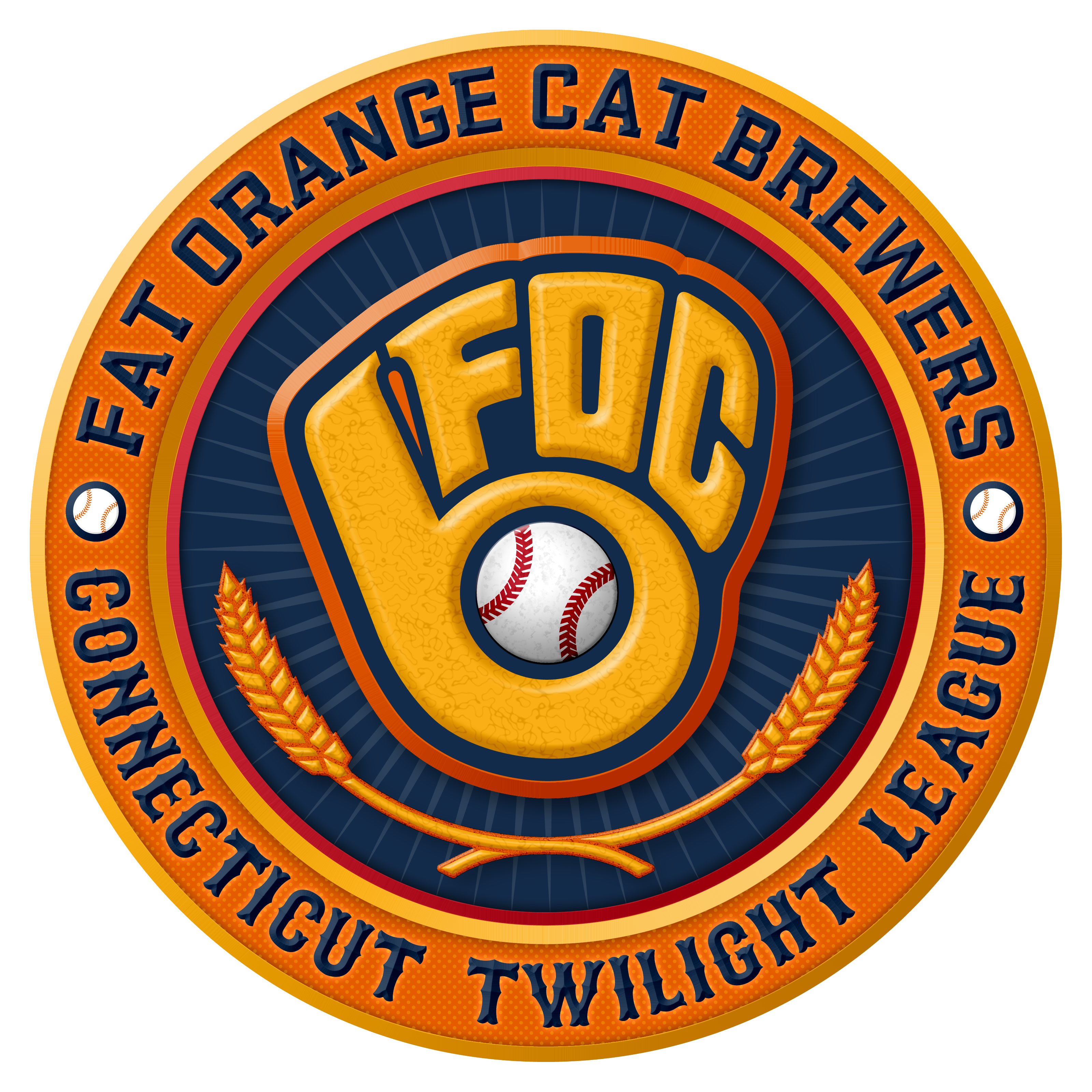
Colors: Orange and Blue
Logo: A tip of the cap to the old Milwaukee Brewers, while seamlessly incorporating the Fat Orange Cat brewery initials.
Opinion: FANTASTIC. The updated retro color choices, the classic yet new logo, the wheat stalks below the logo (possibly inspired by the Milwaukee Brewers more recent logo). This logo is what other logos should strive to be. The one hiccup is that for some reason, the baseball doesn’t seem to sit right in the glove, it’s the shading or something, but besides that, gorgeous.
2) Chicago Sam’s Orioles
![]()
Colors: Orange and Black
Logo: The face of an Oriole
Opinion: Baltimore take note, this Oriole logo sets the standard for the often copied baseball team name. The closeup of the face, the intense brow, the feather detail, the teeth… wait what? Okay who gave the bird teeth? The only other knock is that the eyes seem a little flat against such a well defined and highlighted face. Much like the Orioles in the playoffs, you do not want to run up against this bird.
1) Willibrew Ridges
![]()
Colors: Dark Blue and Cyan
Logo: Ridges in a shadowed script, overlapping the outer circles, with their namesake mountains in the background and the Willibrew logo above the team’s nickname.
Opinion: Gorgeous, this badge brings everything together. While other badges feel like logos put in the middle of two circles, this one was made with intent. Even the pinstripes that are on most of the other badges are modified to be rays coming out from behind the mountains. The Ridges were the only team to effectively use the background properly, and they still managed to properly recognize their title sponsor. The use of similar colors instead of contrasting colors provide this badge with a really smooth feel. Great job.
The 2019 season has brought us these beauties, but if you don’t like where you fall on this list, make a change, update, adjust, tweak, revamp, anything. Can anyone dethrone the Ridges? We’ll have to wait for next year to find out. Use the comments to let me know what you think about the rankings and why I’m right.
*editors note… all 10 of the “badge” designs were composed and put into the circle logo system by Scott Dickens. Copyright to the Connecticut Twilight League and their 10 teams. 7 of the team logos themselves were designed by Scott. The Dodgers central “D with bat and ball” logo was designed by Nico Spuches. The Elmer’s E logo was put together by Scott Dickens, but composed of a pre-existing E from the Elmer’s Place logo, and the wing in the style of the old look Anaheim Angels. The Glastonbury Pirates skull pirate head is heavily modified from a clipart skull to transform it into the baseball pirates version here.


No Responses to “2019 Team Logo Power Rankings… by Brian Murray”